← All workbranding

SHP Services

  • Creative Direction
  • Brand Identity
  • Campaign Design
  • Motion Design
  • Digital Communication
  • Operational Branding
  • Customer Experience

A bright service brand built around care, clarity and a simple smile

The SHP Services brand identity turns an everyday cleaning service into a positive experience. A simple smile gives the brand its friendly and recognisable character. Teal communicates freshness, while yellow adds warmth and optimism. Clear messages make each service easy to understand. The result is practical, memorable and designed for daily use.

Two individuals from a cleaning service working together to clean a room, highlighting teamwork and attention to detail.

Building a friendly identity around a simple smile

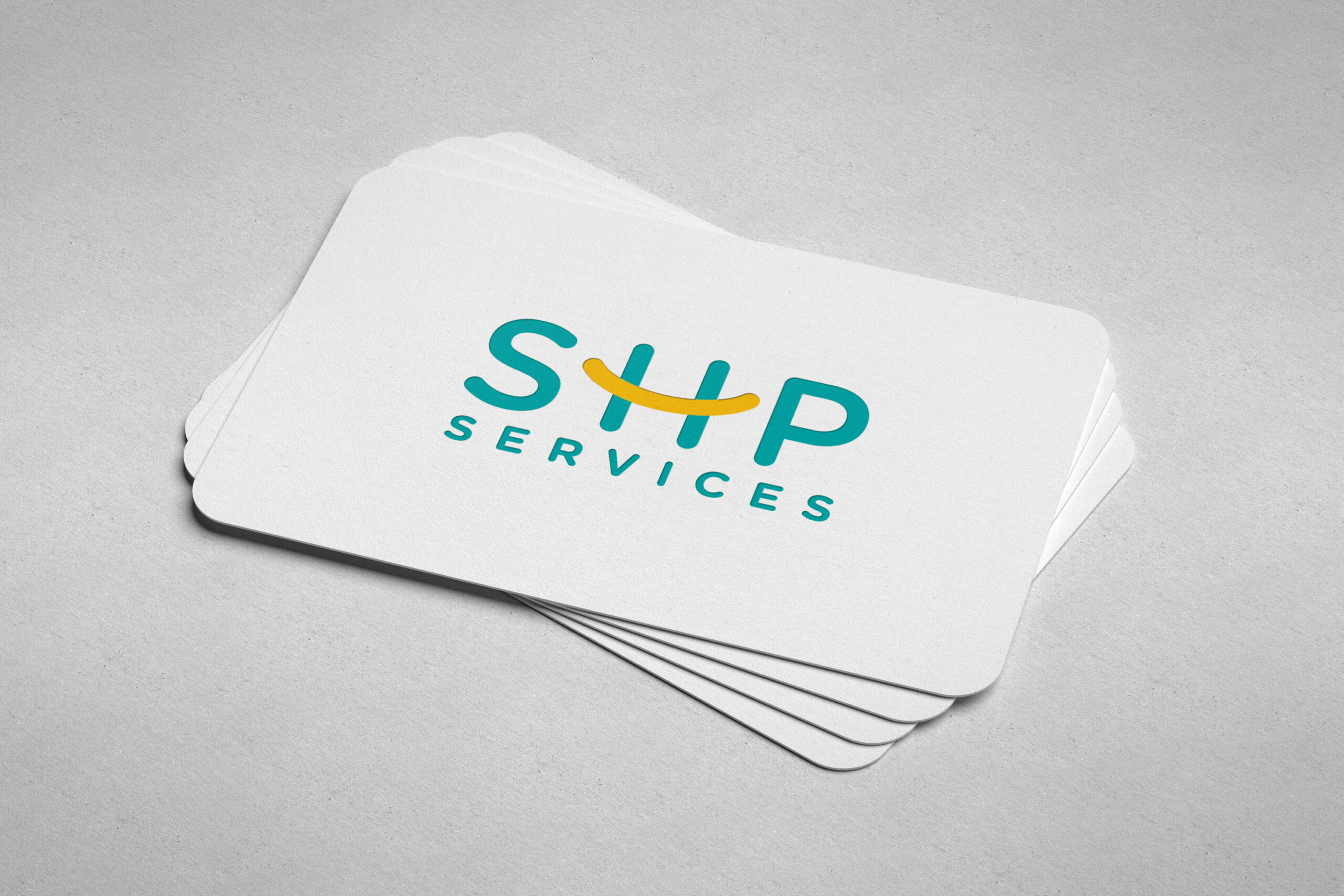
The logo transforms the letter H into a simple smile. That small gesture defines the tone of the whole brand. The colour system feels fresh, warm and easy to recognise. Simple shapes help the identity remain consistent across every format. As a result, the brand feels approachable without losing professionalism.

Close-up of a roll of tape with a colorful round sticker attached, highlighting its texture and shape.
Elegant SHP Services logo displayed on white velvet laminated business cards, featuring round corners for a refined look.
Multiple laminated white velvet business cards displaying the word "slip," showcasing rounded corners and a professional design.
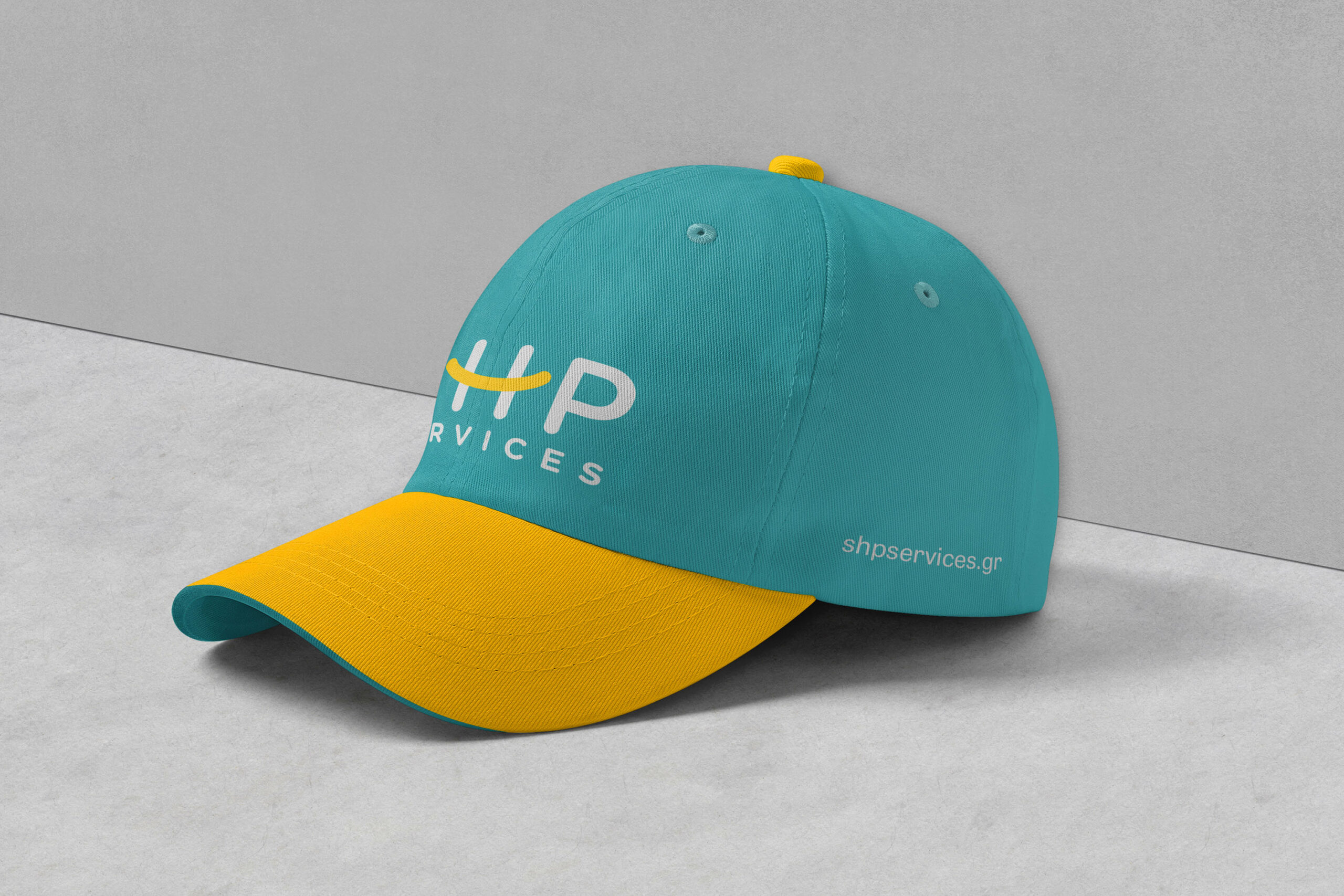
SHP Services baseball cap design.
Two men dressed in black t-shirts that display "Survival Happy People," highlighting the SHP branding.

Turning everyday cleaning into a bold campaign voice

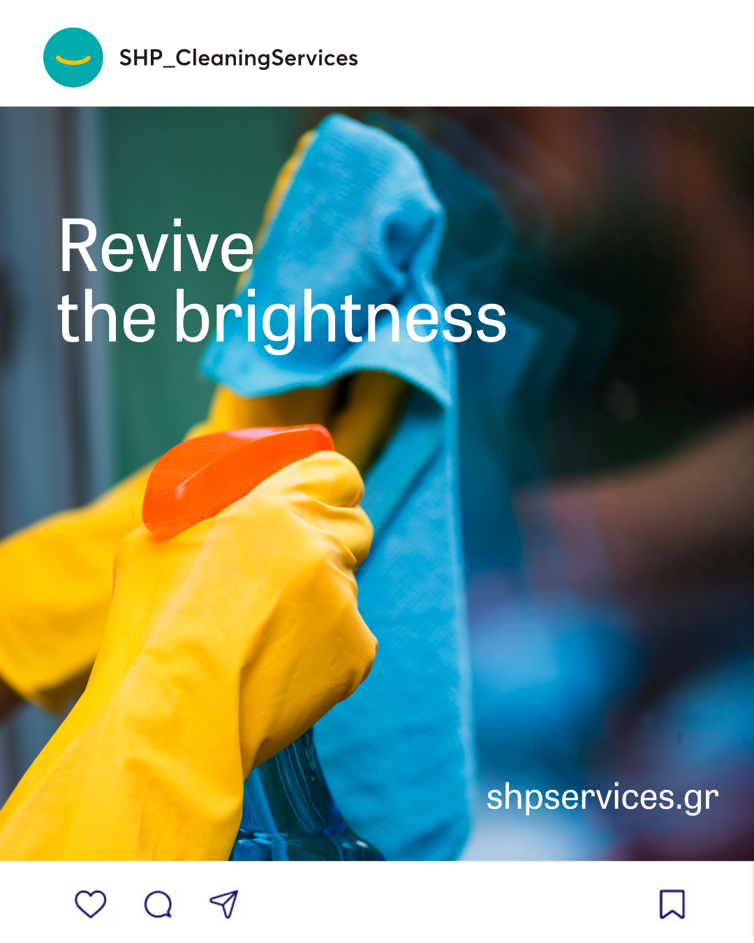
Cleaning communication is often functional and predictable. SHP uses short messages to make it brighter and more engaging. Photography and flat graphics create a flexible campaign language. Meanwhile, the smile connects every application to the identity. The system works across social media, posters and large outdoor formats.
A professional cleaner in uniform using a vacuum cleaner in a bright, tidy living room, showcasing cleaning services.
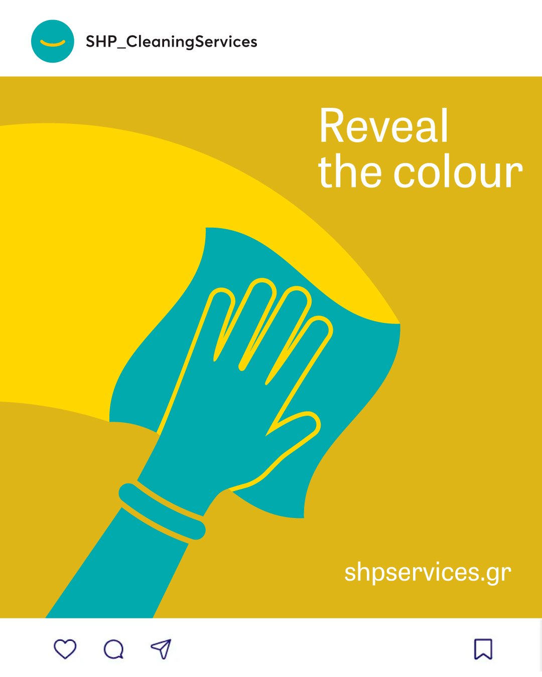
A close-up of hands using a cleaning cloth on a surface, illustrating the ongoing effort to maintain a clean environment.
A visually engaging post illustrating shipping services, enhanced by a bold and colorful design to capture viewer interest.
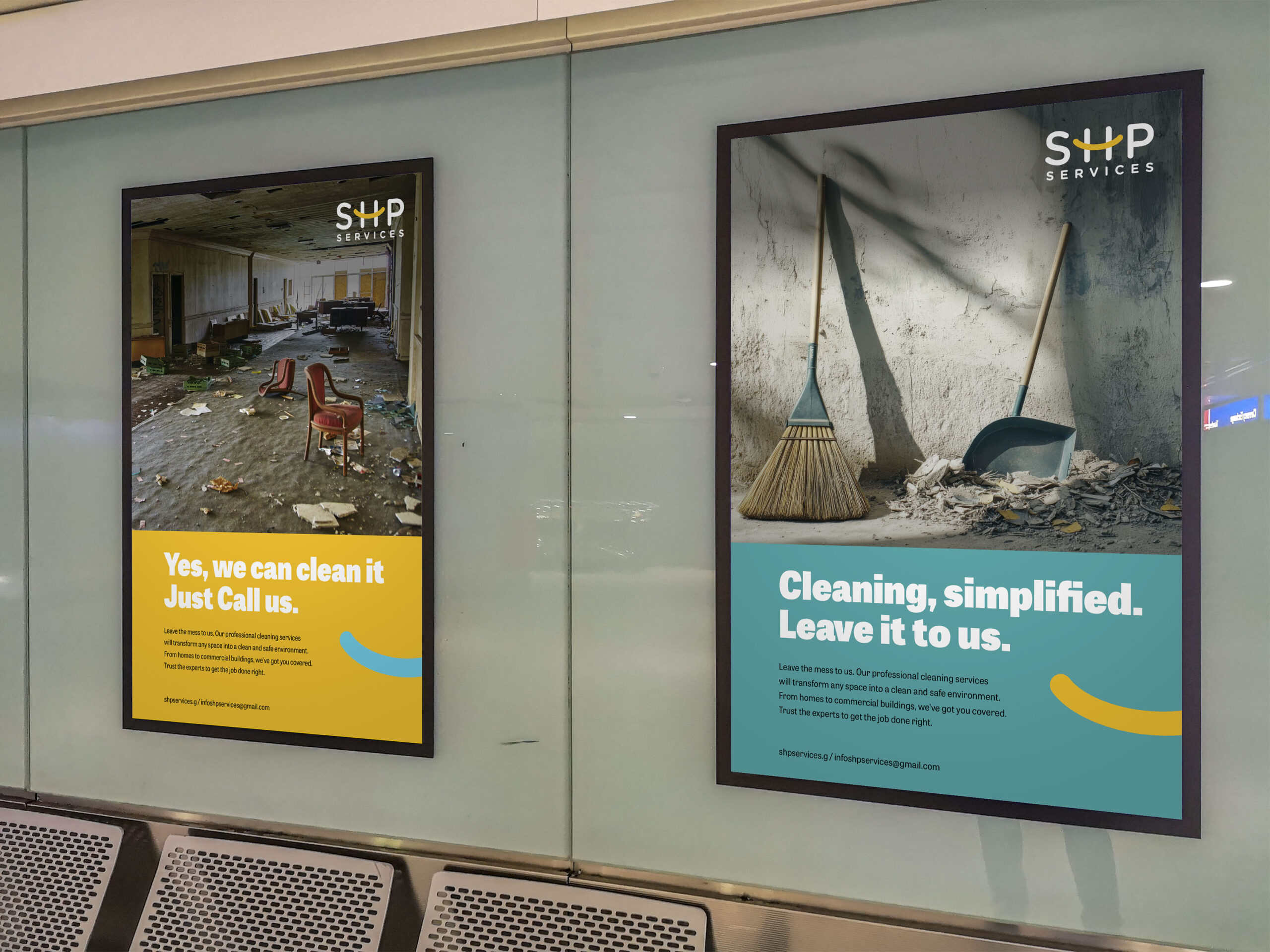
A wall adorned with multiple posters showcasing SHP Cleaning Services in a public environment.
An eye-catching visual for the SHP campaign, showcasing bright colors and the message of revitalizing one's brightness.
A transformation image showing a murky environment evolving into a vibrant, magnificent landscape.
A before-and-after transformation showcasing a dull space turned into a vibrant, inviting environment.
SHP Cleaning Services Fence ad banners design.

Making the service visible at every step

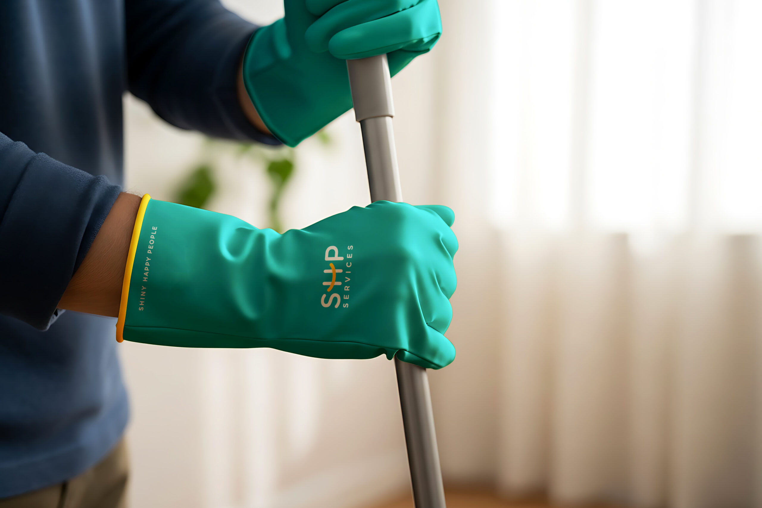
The identity also supports the team during real work. Branded clothing and equipment create a clear presence on site. Simple signs explain when a service is in progress. Vehicle graphics extend the brand beyond the workplace. Together, these touchpoints make SHP feel organised and dependable.

A yellow van, specifically a SHP Doblo, is parked outside a house, highlighting its practical and eye-catching appearance.
A person with green SHP gloves is poised with a mop, indicating a cleaning task.
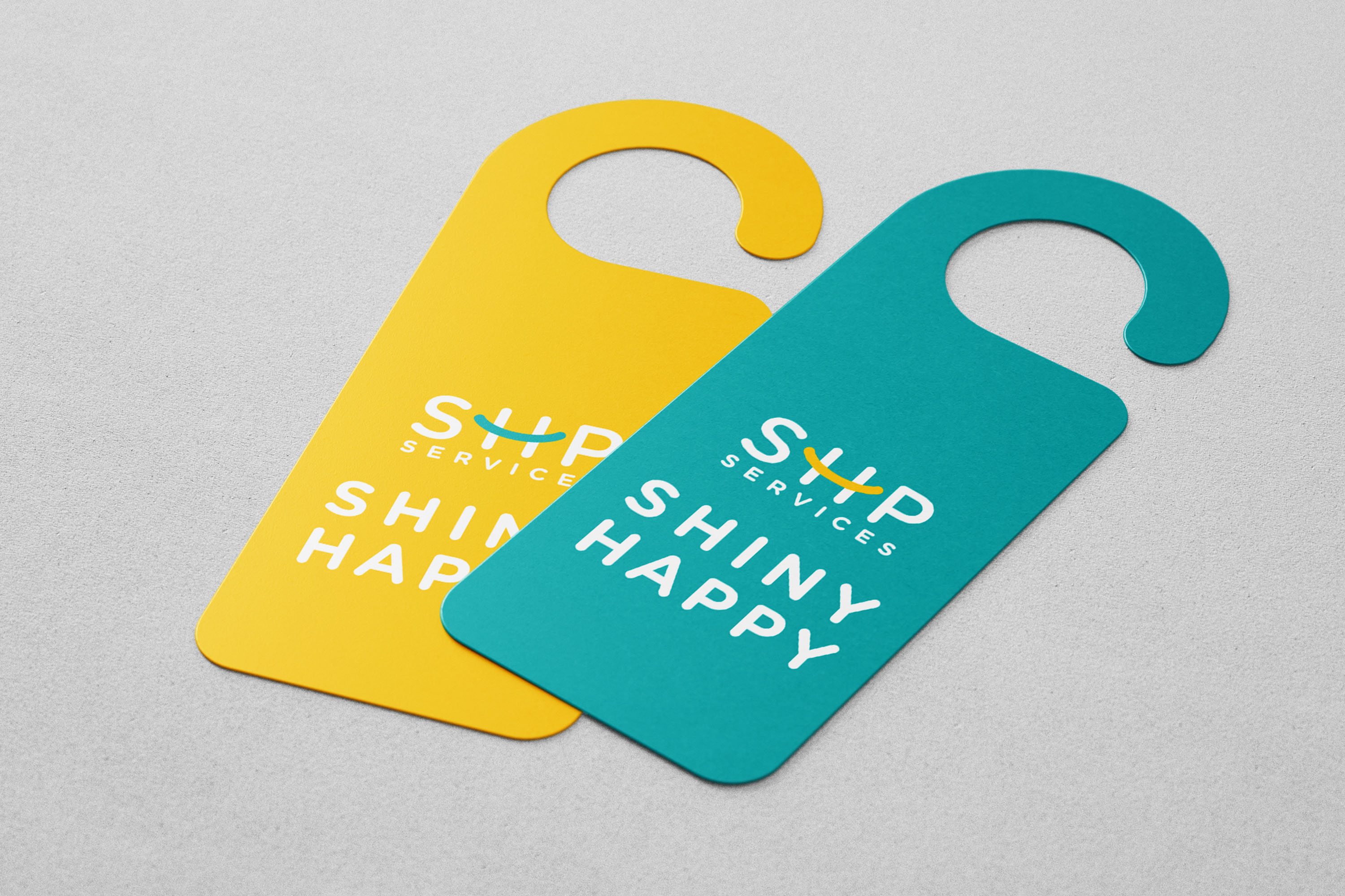
A pair of door hangers featuring the text "Shiny Happy" prominently displayed in vibrant colors.
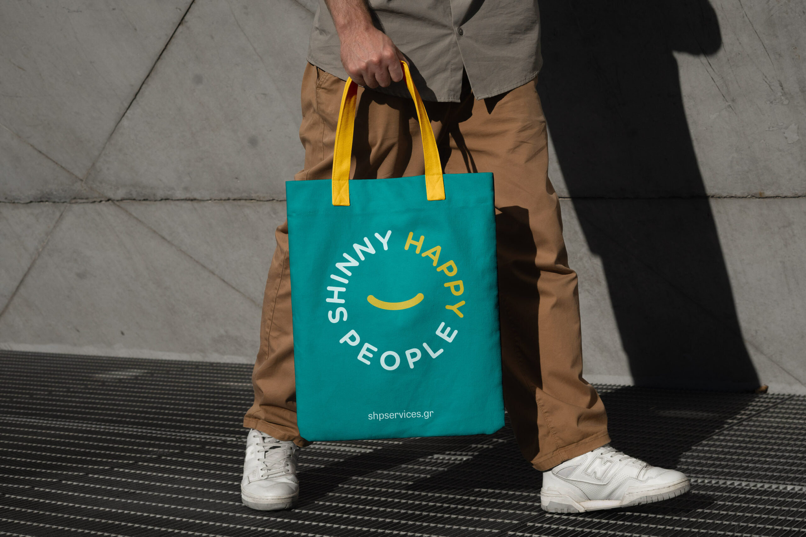
man carries a blue and yellow tote bag, demonstrating its stylish design and practical use for shopping.

From simple booking to a thoughtful finish

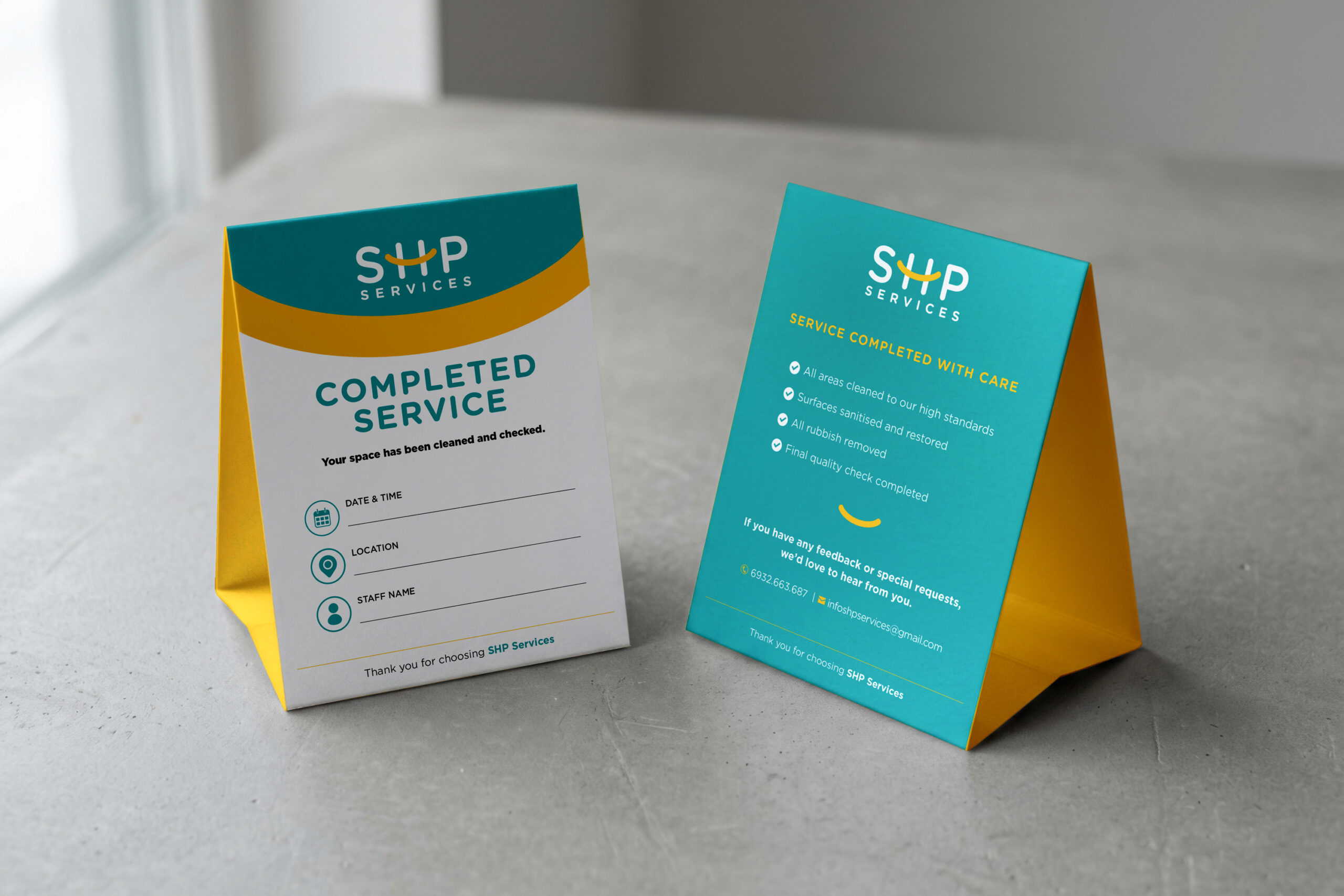
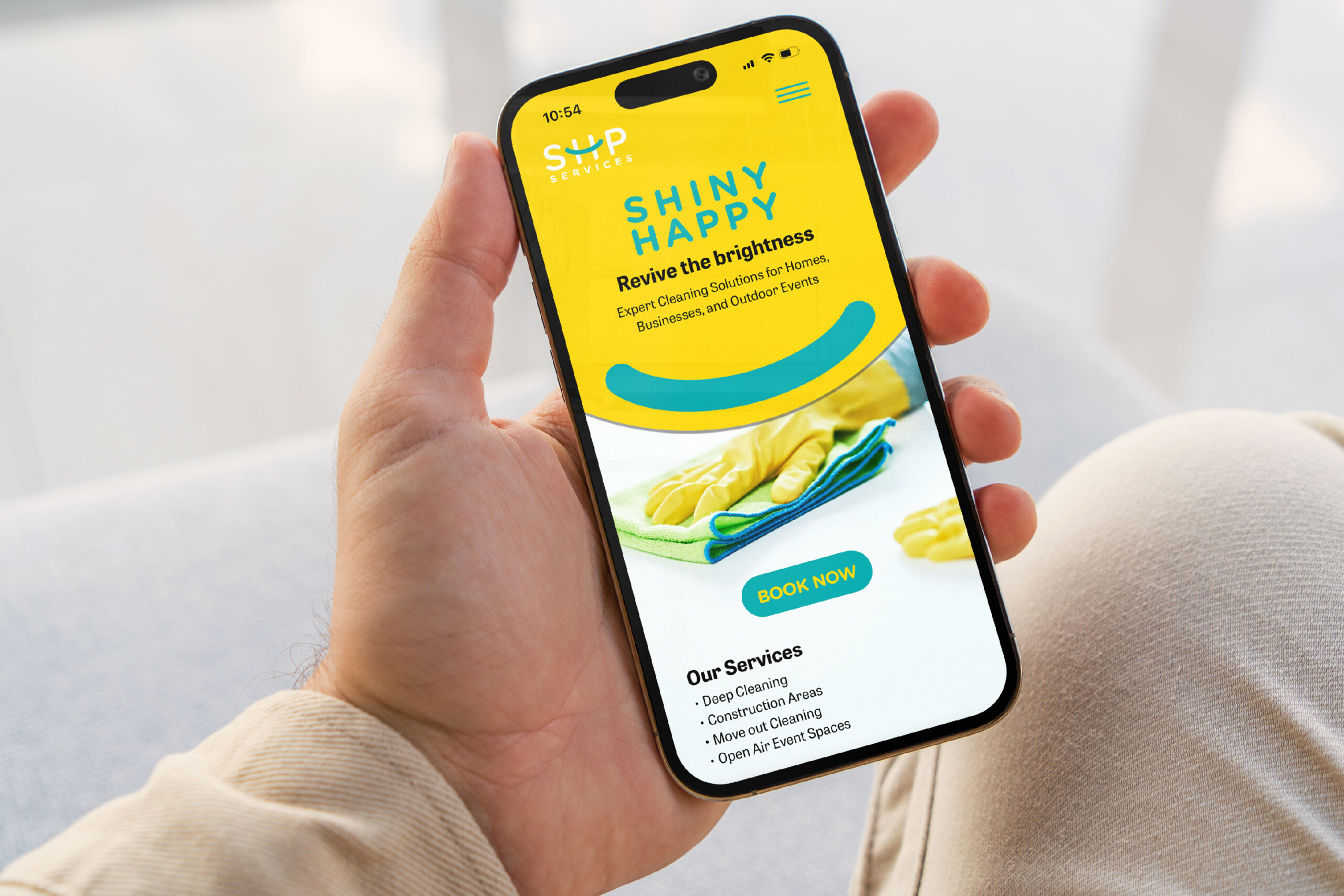
The customer journey starts with clear information and an easy booking path. The mobile experience explains the services and guides users toward action. The brochure supports sales conversations and service planning. After each visit, a completed-service card confirms the final quality check. Finally, small care details leave a positive and memorable impression.

Clean and modern trifold brochure mockup for a cleaning service, showcasing an organized layout and appealing graphics.
A cheerful mobile app layout featuring bright colors and easy navigation for booking options.
Table tent featuring a yellow and blue design, indicating cleaning services completed.

A service brand designed to feel bright, clear and dependable

Across identity, campaign, operations and customer care, SHP follows one consistent idea. Every touchpoint is simple, visible and human. The system helps the company look professional without losing warmth. It turns a practical service into a distinctive and positive brand experience.