← All workbranding / prints

aperitto

  • Creative Direction
  • Brand Identity
  • Retail Branding
  • Digital Design
  • Editorial
  • Environmental
  • Motion

Brand identity and retail experience for a contemporary furniture store

aperitto is a furniture store brand identity project for a contemporary retailer focused on modern design, quality materials and thoughtful living. The identity needed to feel refined and approachable. It also had to support both the digital and physical customer experience. A calm grey palette, generous white space and one red accent create a clear visual language. The small red dot gives the wordmark a distinctive and memorable detail. The system extends across the website, showroom, catalogues, product information and retail communication.

Exterior view of an apartment building showcasing the "Aperitto" sign at the entrance, indicating the store's location.

A calm identity with one distinctive detail

The identity is built around a refined serif wordmark. Its grey tone creates a quiet and premium character. The red dot above the “i” adds energy and recognition. It also becomes a flexible graphic element across motion and communication. The system uses clean layouts, simple typography and generous space. As a result, it remains consistent across web, social media and printed application

Mobile social stories on two iPhones, showcasing a chair and a sofa as part of the narrative.
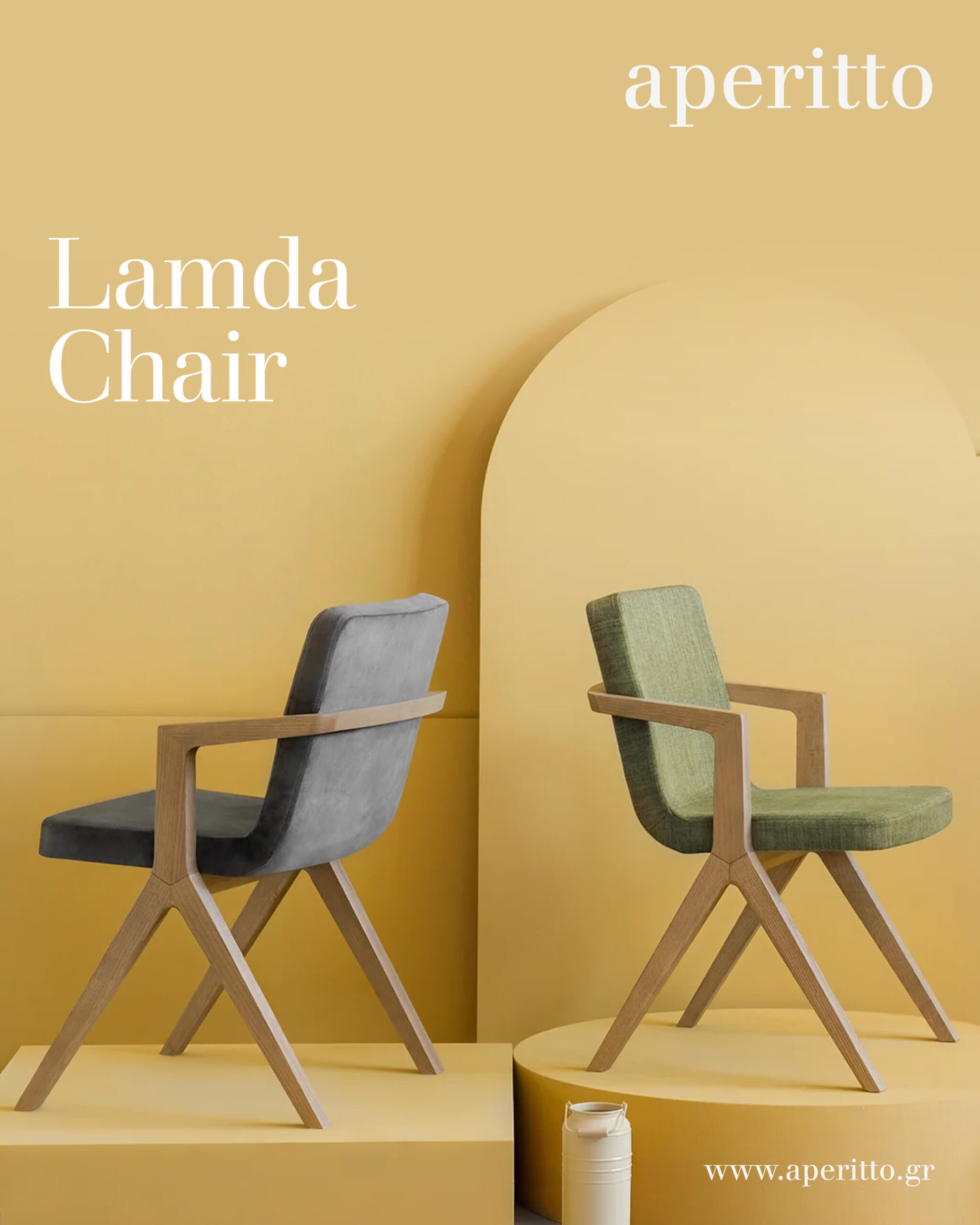
A Lamda chair positioned in a cheerful yellow room, highlighting its contemporary style and inviting atmosphere.
A pair of Marien stools featuring a sleek design, emphasizing their stylish and contemporary appeal.
Elegant blue sideboard with gold legs, adorned with a painting on the wall behind it.
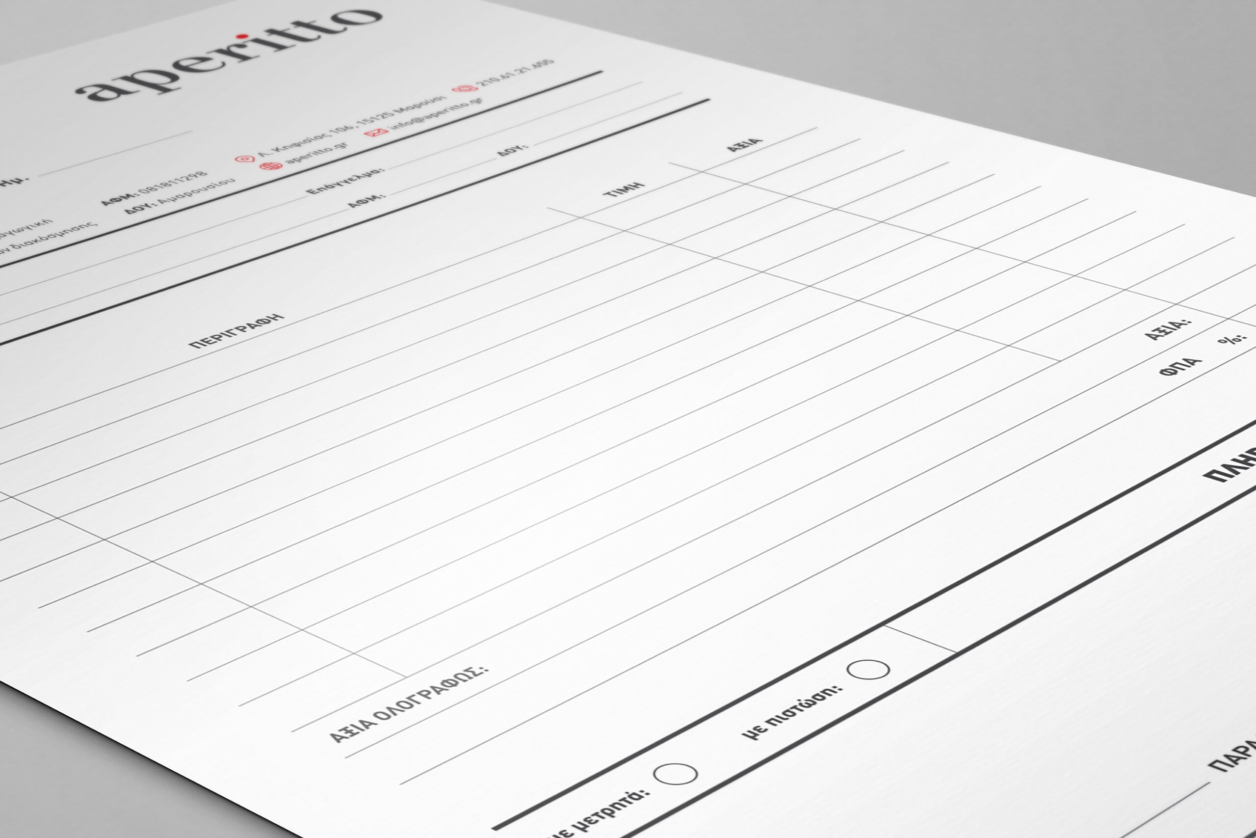
A monochrome A4 receipt form displaying fields for order items and customer details.
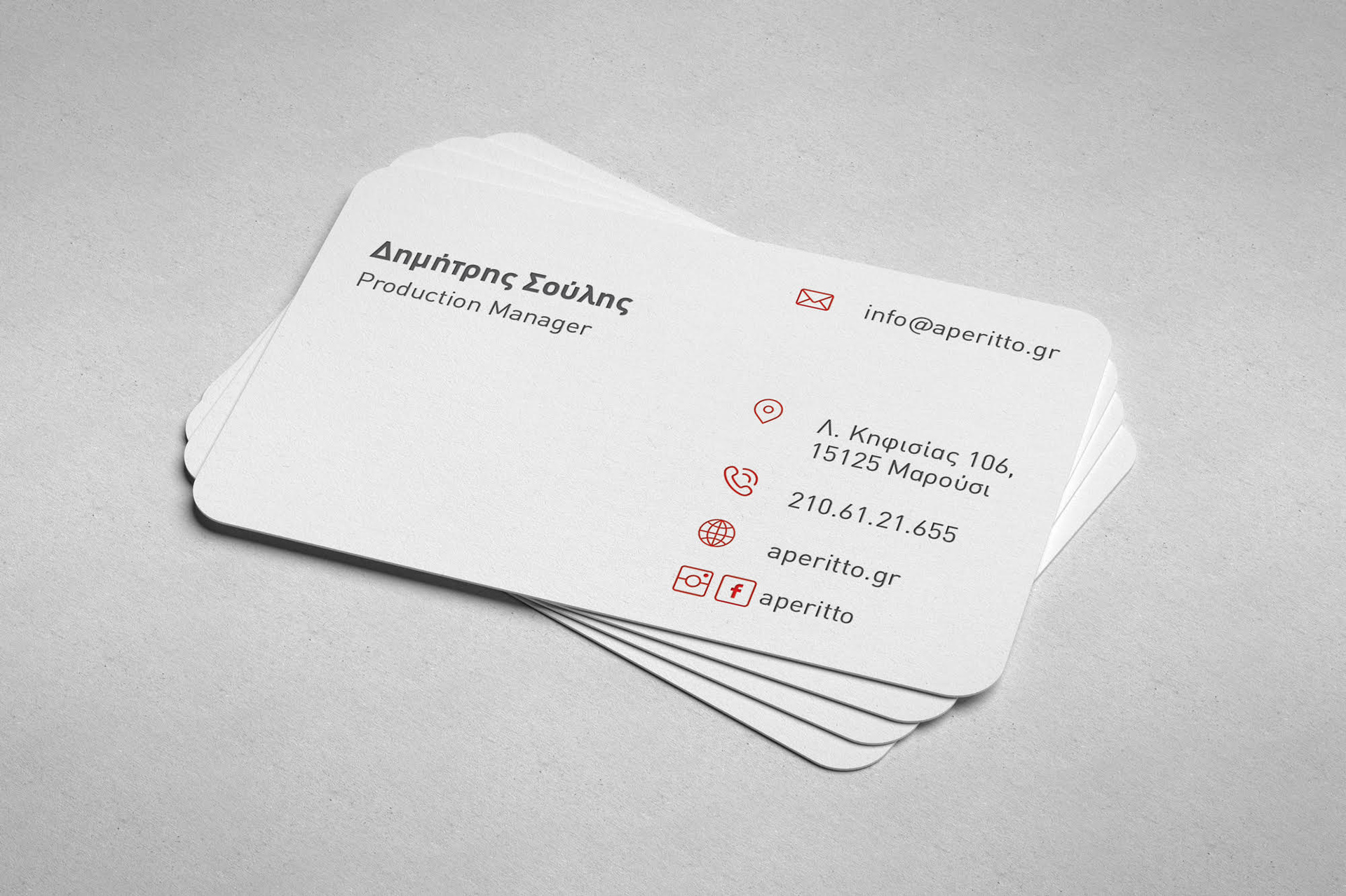
A close-up view of a stack of Aperitto business cards resting on a white background, highlighting the reverse side.
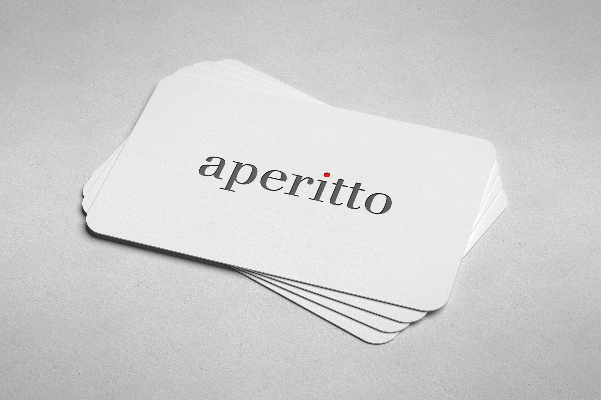
A close-up view of a stack of Aperitto business cards resting on a white background, highlighting the front side.
A presentation folder showcasing the word "Aperitto" in a stylish font on its exterior.
The image displays a white paper shopping bag with a vibrant red border at the top and red sides. Two dark gray, ribbed ribbon handles are attached to the inside of the red border. The word "aperitto" is printed in a dark gray, serif font centered on the front of the bag. A small, bright red dot is placed above the letter "i" in "aperitto." The bag is positioned at a slight angle, with its front facing the viewer and its right side visible. The background is a neutral, light gray, and a sharp shadow is cast by the bag to the right, indicating a light source from the upper left. The composition is clean and minimalist, focusing entirely on the shopping bag.

Bringing the identity into the showroom

The brand extends into a calm and carefully curated showroom environment. Furniture, materials and lighting define clear zones within the space. Meanwhile, the aperitto logo appears as a subtle architectural signature. Neutral surfaces create a warm backdrop for the products. Small red accents connect the interior with the wider identity. The result feels more like a furniture gallery than a conventional retail floor.

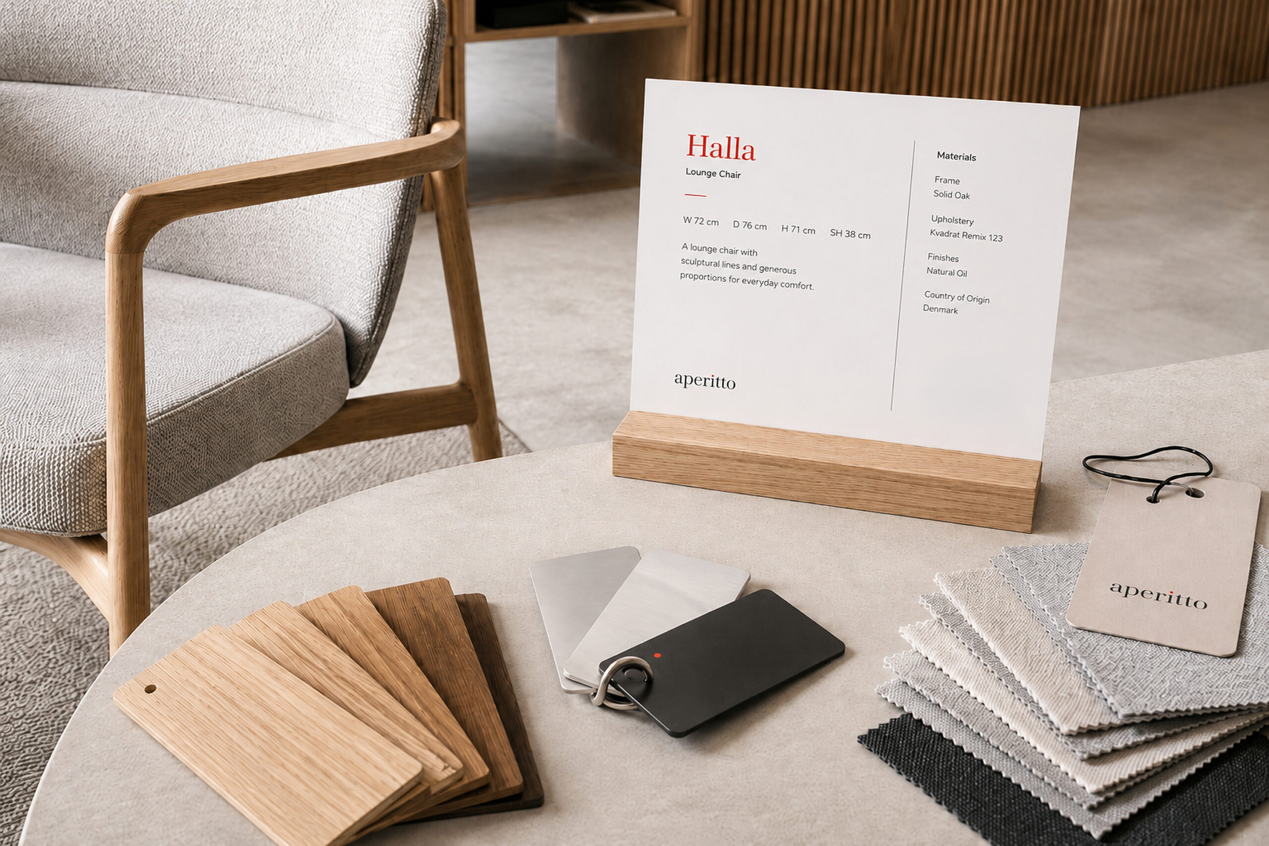
Chic interior of the Aperitivo showroom in Athens, featuring contemporary furniture arrangements and sophisticated design elements.
A table accompanied by a chair, with a card displayed on the tabletop.

Presenting furniture with clarity and character

The product catalogue introduces each piece through a clear editorial system. Large lifestyle photography gives context and atmosphere. Product views, dimensions and short descriptions provide the essential information. The layout uses white space and small red details to guide the reader. Therefore, the catalogue feels informative without becoming technical or dense. The Halla and Holla chairs show how the system adapts to different forms, materials and finishes.

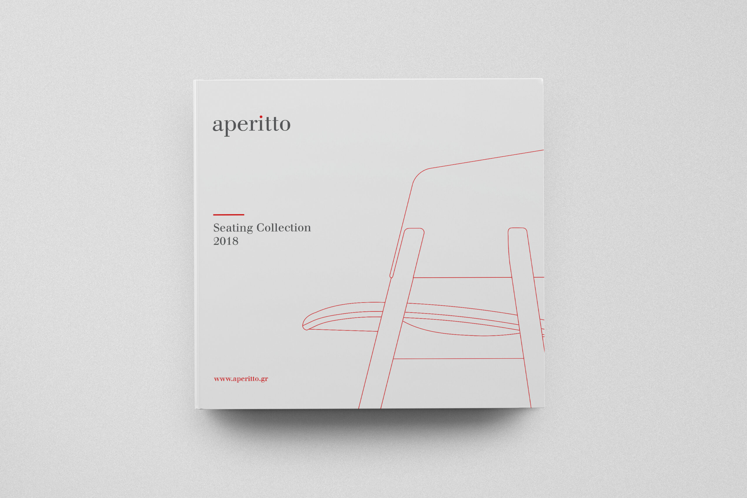
Aperitto seating catalogue cover displaying a minimalist design with a white cover and striking red lines.
n open book featuring a detailed image of a table surrounded by chairs, illustrating a seating layout.

Extending the identity across campaign and retail touchpoints

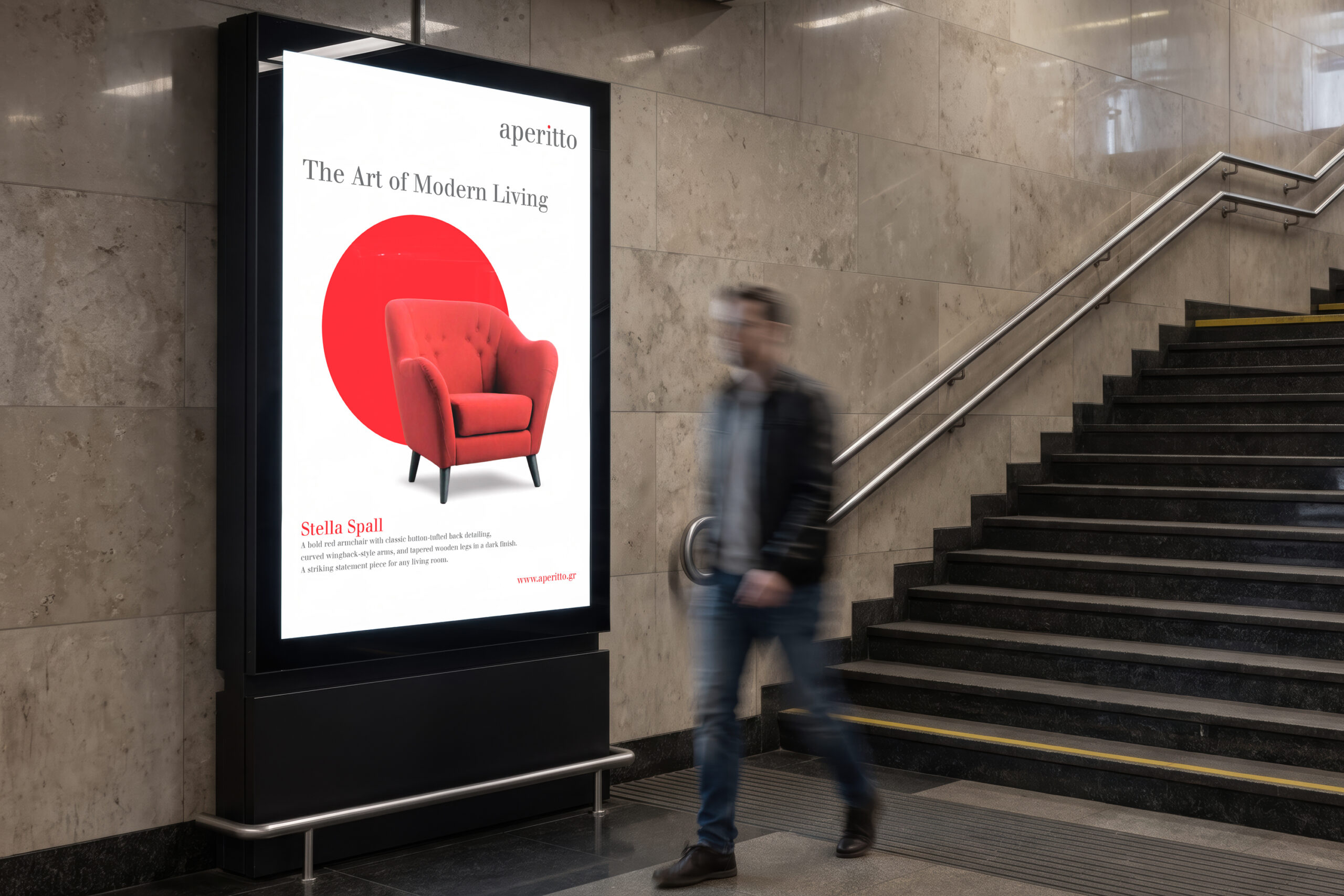
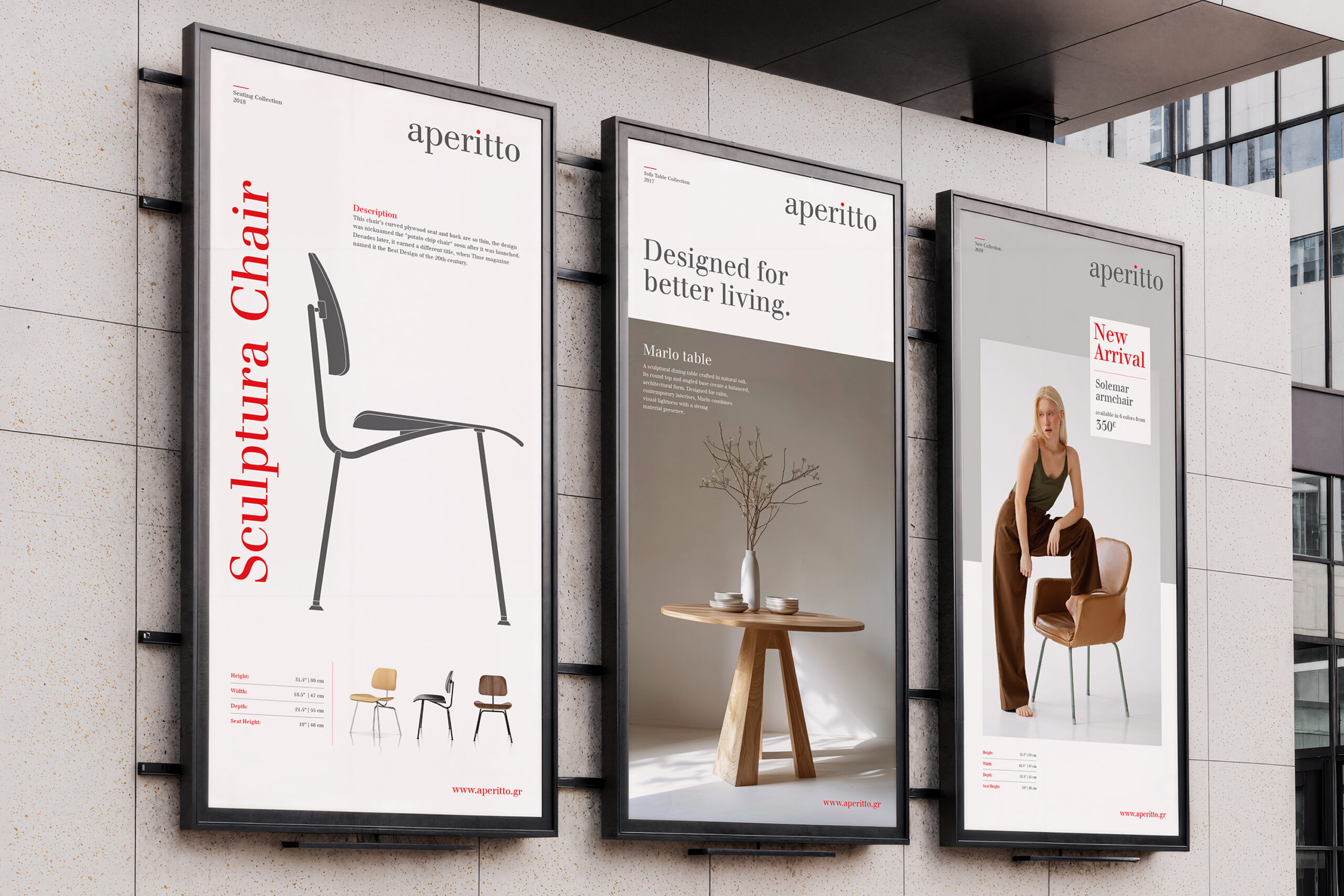
The aperitto identity also extends into campaign and promotional communication. Magazine advertising uses calm compositions, product-led imagery and concise messages. Posters and billboards create more impact through scale and contrast. At the same time, the voucher brings the same visual language into a smaller and more personal customer touchpoint. Together, these applications show how the identity can move from editorial communication to public space and retail experience.

Individual engaged in reading a magazine on editorial design, seated at a desk with a table visible behind them.
A man walks down stairs next to a prominent Aperitto advertisement in the metro station.

A complete identity for contemporary living

The final system connects digital platforms, showroom branding, product communication and campaign design. Each application uses the same restrained visual language. However, the system remains flexible enough to support different products, collections and customer needs. The result is a contemporary furniture brand with clarity, warmth and a strong sense of design.