← All workbranding

My Spa Day

  • Wellness Branding
  • Packaging Design
  • Product Identity
  • Botanical Illustration
  • Visual Systems
  • Retail Communication

Wellness packaging and brand identity for a premium spa product line

My Spa Day is a wellness packaging and brand identity project for a contemporary spa product line. The brand needed to feel clean, calm and premium, while still keeping a natural and approachable character. The design direction uses a soft turquoise palette, botanical illustration and refined typography. Together, these elements create a fresh visual language for skincare, body care and home spa products.

My Spa Day product line showcasing stylish packaging with calming hues and a modern design for a luxurious spa experience.
My Spa Day Body Oil Family.

A fresh packaging system for everyday wellness

The packaging system gives each product a clear role inside the same visual family. Boxes, bottles, jars and home fragrance items share the same structure, colour and botanical detail. At the same time, each product keeps enough space for its own information. This helps the range feel organised, easy to read and ready for retail use.
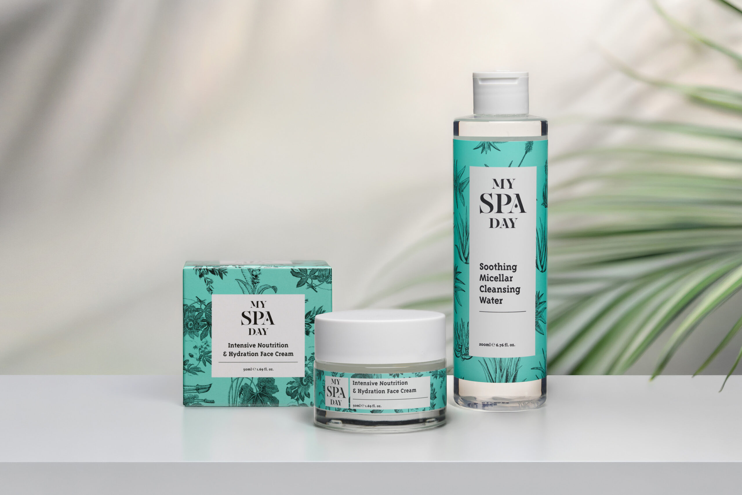
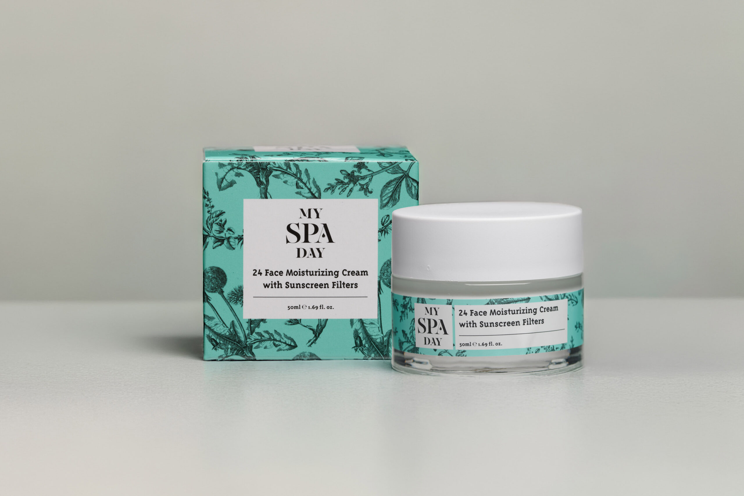
My Spa Day 24 Face Moisturizing Cream jar, featuring a sleek design, placed on a serene spa setting background.
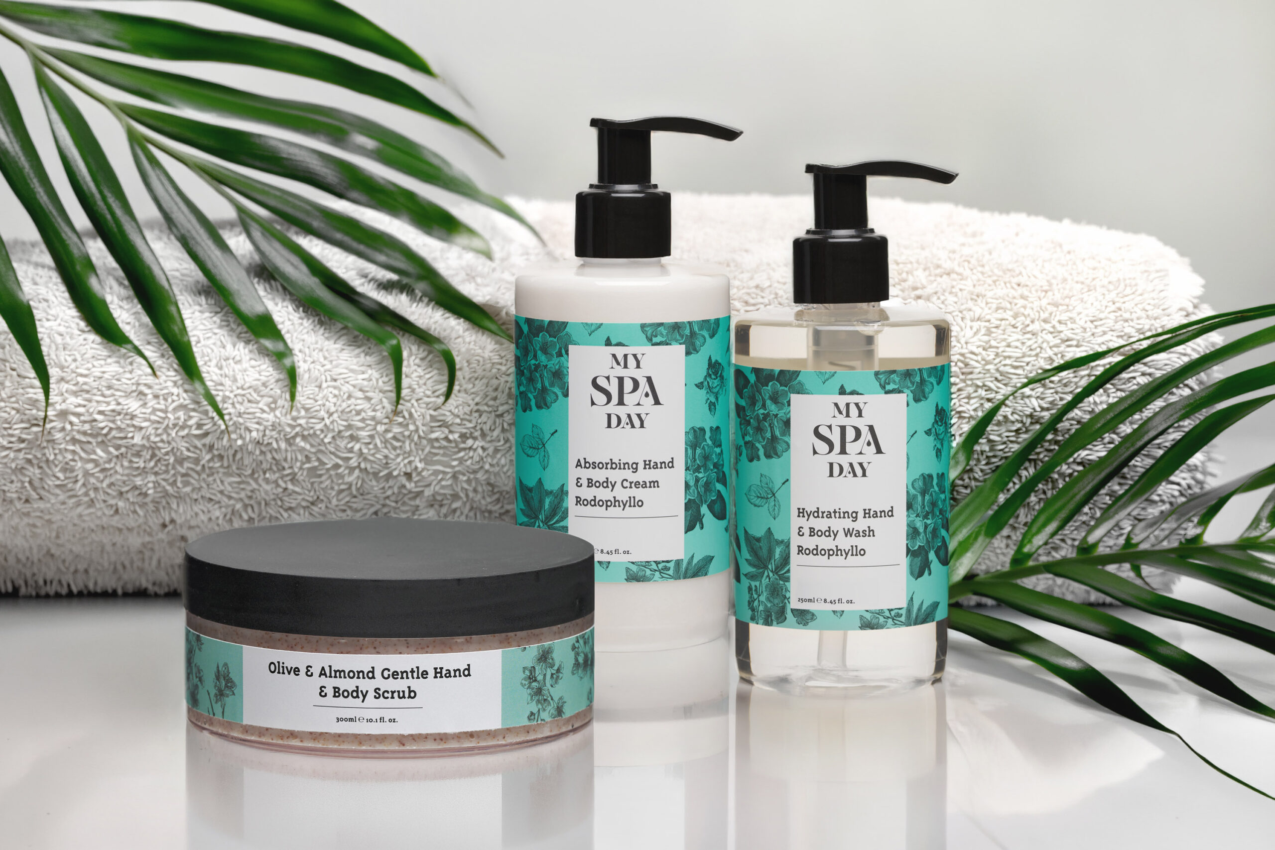
A luxurious spa gift set with a body scrub, body lotion, and body wash displayed on a serene background.

Extending the brand into digital and editorial communication

The identity also extends into digital and editorial formats. The website and printed material use the same calm visual language as the packaging. Product photography, white space and botanical illustrations help the communication feel soft and clear. As a result, the brand can explain the product range without losing its premium spa character.

My Spa Day Website Design. Floating Pages Presentation.
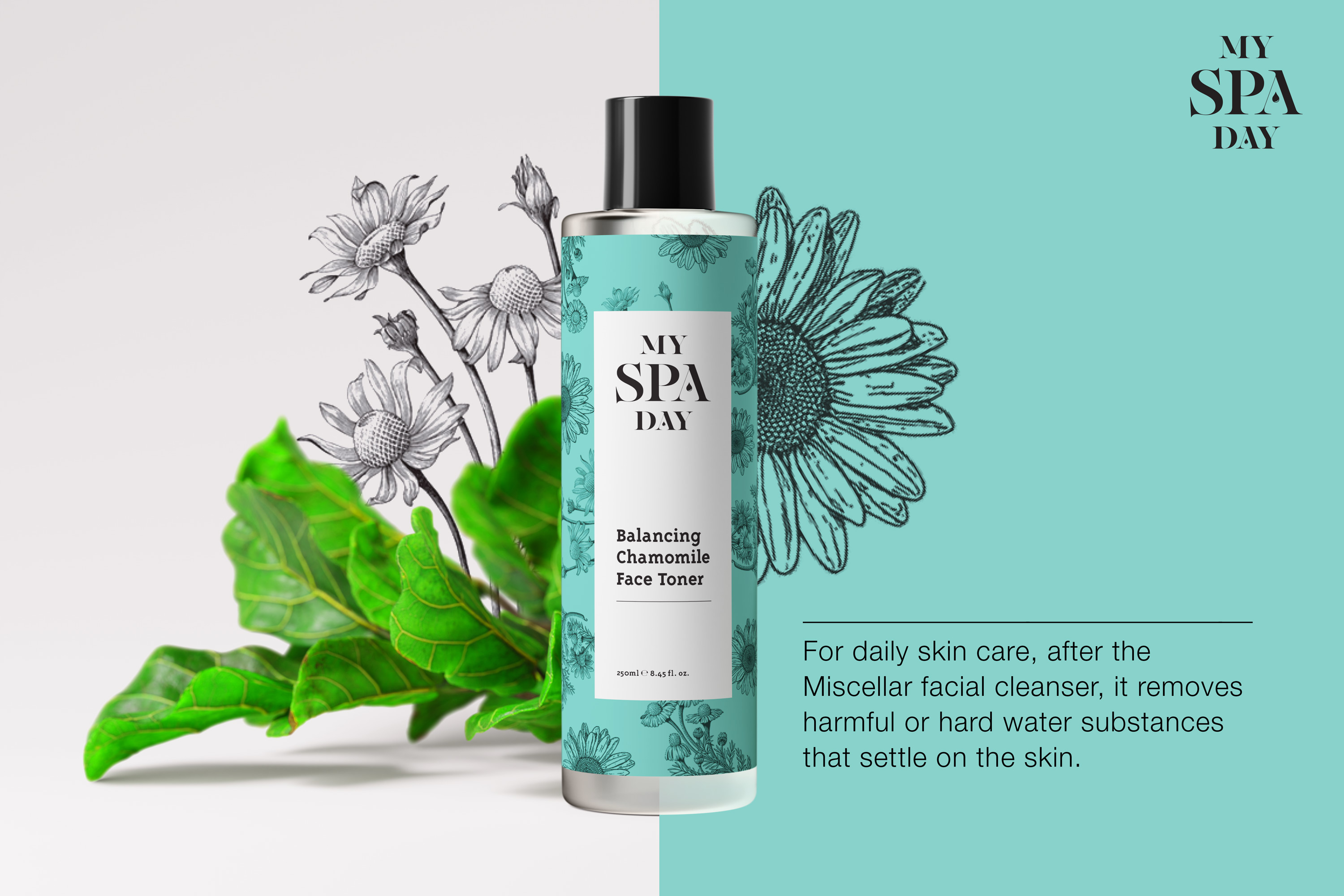
Promotional card highlighting "My Spa Day" with an array of natural beauty products set against a calming spa backdrop.
A serene spa setting featuring calming colors, candles, and a tranquil atmosphere promoting relaxation and self-care.

Bringing the identity into the spa experience

The brand was designed to work beyond the product packaging. Posters, printed material and retail touchpoints bring the identity into the spa environment. The visual language stays calm and elegant. However, the turquoise colour gives the brand a fresh and recognisable presence inside beauty, wellness and retail spaces.
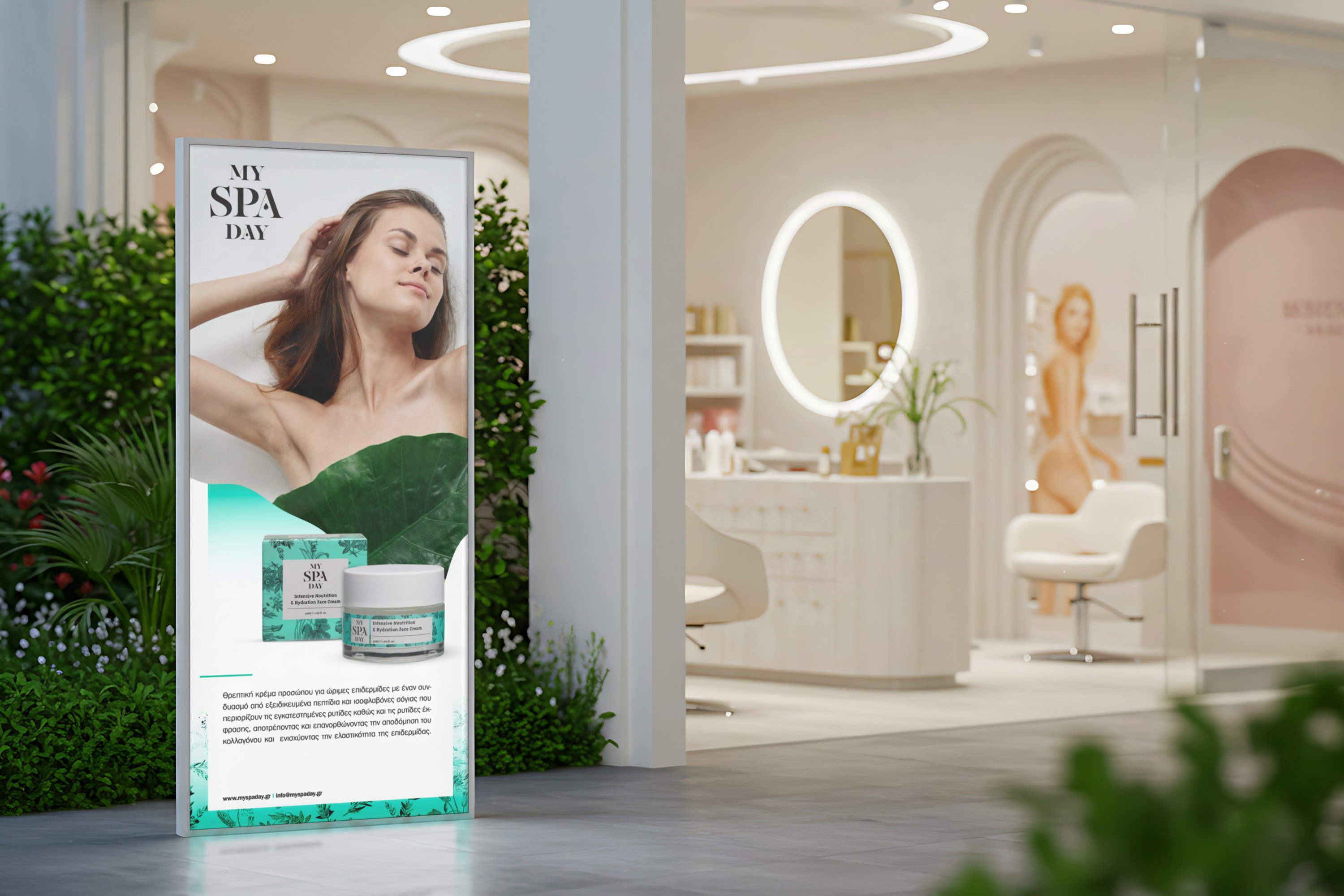
My Spa Day Billboard adaptation.
A counter in a spa salon featuring three bottles of body oils, highlighting relaxation and self-care options.
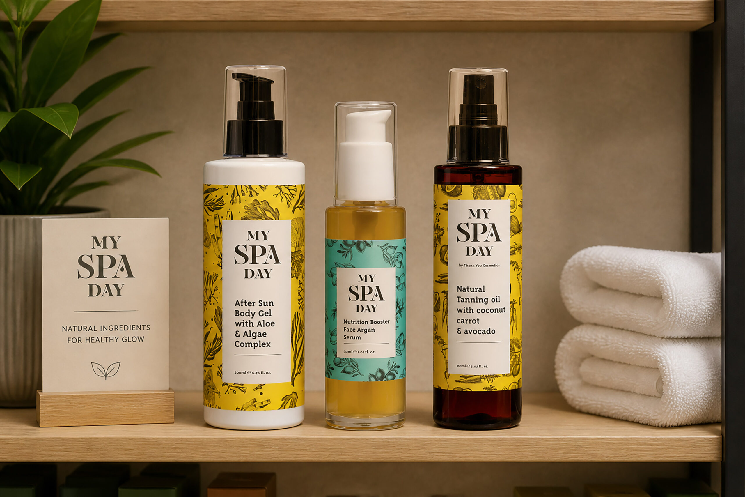
A neatly arranged shelf showcasing an assortment of spa day body products, highlighting their vibrant colors and labels.
My Spa Day Magazine Spread

A calm brand world for skincare and self-care

The campaign language focuses on product benefits, ingredients and self-care moments. Clean product photography works together with botanical illustration and short copy. This gives the brand a more expressive voice. It can promote individual products, explain their use and still keep the calm feeling of a spa ritual. The final identity gives My Spa Day a complete visual system for wellness products, retail communication and spa-related touchpoints. The result is a fresh and premium brand world that feels soft, natural and easy to recognise.